Author: sel gerosa

  • Accessible and Modern Redesign of a Spiritual Center’s Website

    Accessible and Modern Redesign of a Spiritual Center’s Website

    1. Elevating Spiritual Journeys: A Transformational Web Redesign

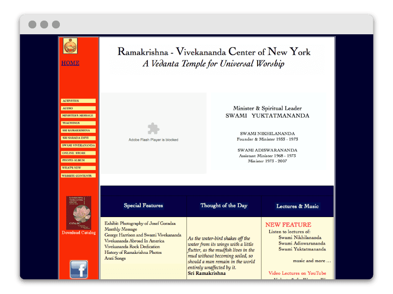
    The Ramakrishna-Vivekananda Center of New York is a branch of the Ramakrishna Order in India. Although they received consistent web traffic, their website, first launched in the early 90’s, was in dire need of a modern update. From unsupported Flash plugins to unresponsive table-formatted HTML, they needed help bringing their new vision to life. I overhauled the website and coded the redesign in pure HTML/CSS/JS. Our goals included an aesthetic refresh, a site architecture strategy, SEO improvements, and E-Commerce integration.

    Since launching, the website’s user base has increased by 60%, and page views have increased by 30%!

    Left ImageRight Image

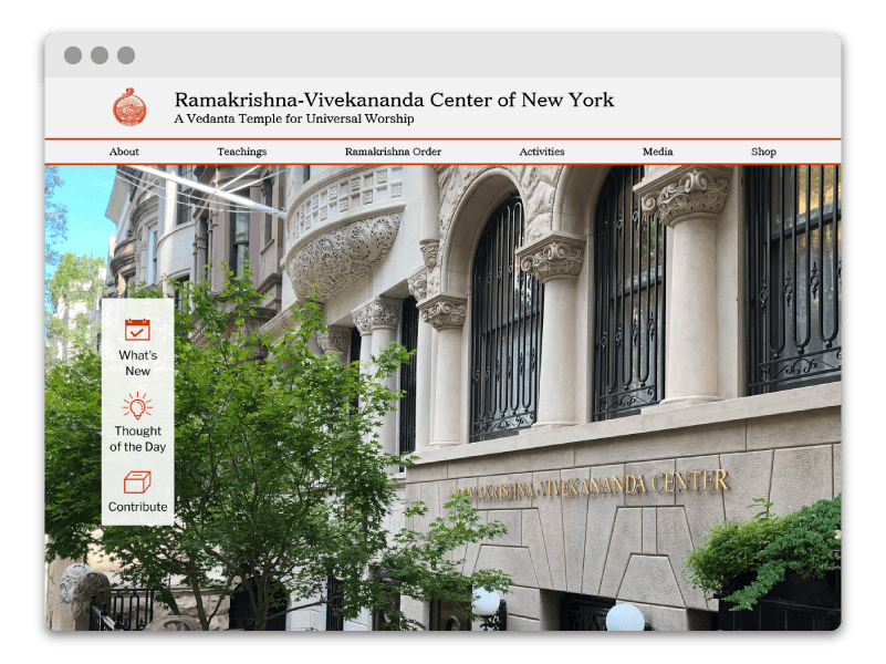
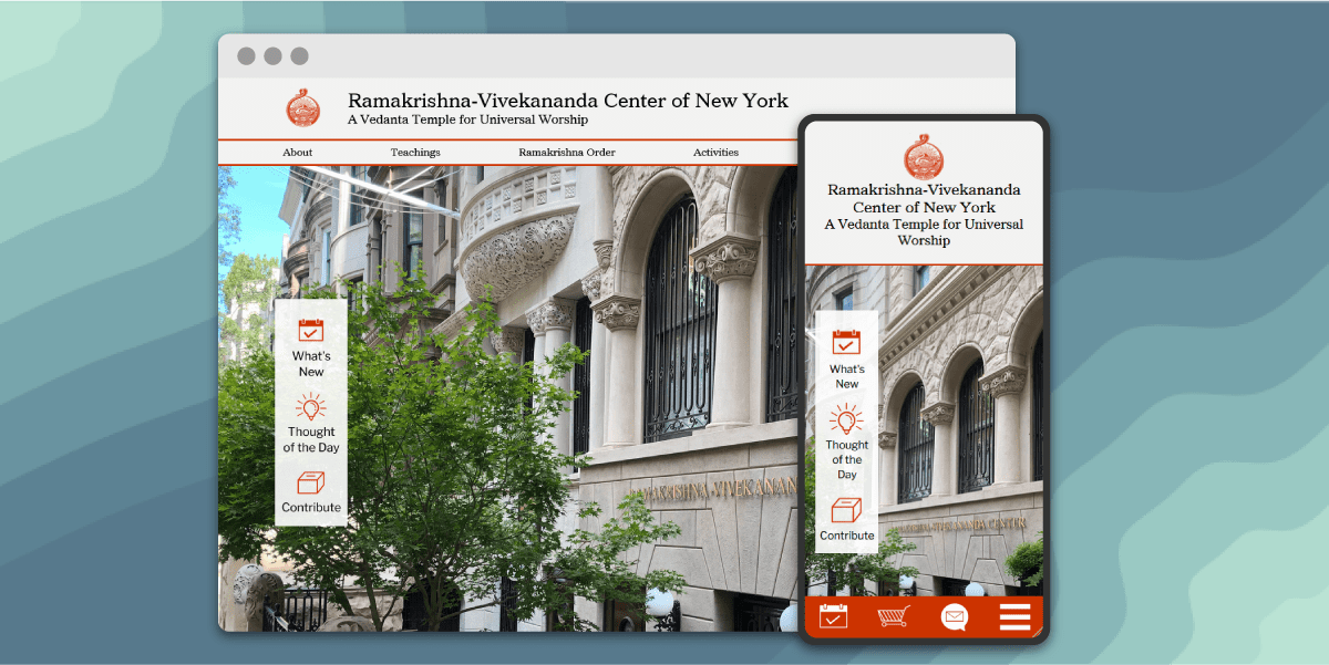
    The Home Page Underwent a Huge Transformation

    2. Website Redesign

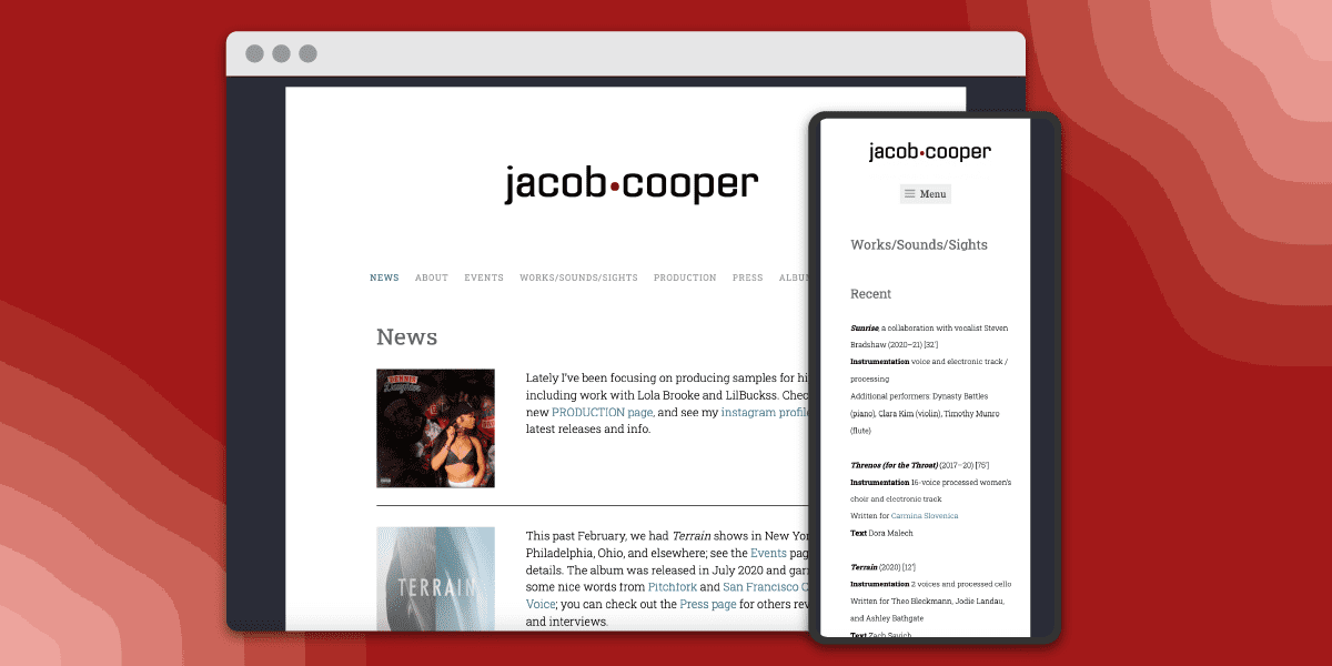
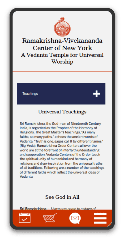
    The original website was right out of a Web 2.0 playbook, plastered with heavily textured backgrounds, broken plugins, and unintuitive galleries, they needed a fresh approach to invite users to discover their spiritual teachings. Taking a minimalist approach, the new website features a clean and organized structure accented with their practice’s characteristic red. It is also fully responsive, delivering mobile site visitors an accessible and readable experience.

    teachings hub page on desktop and mobile, website redesign

    3. Strategic Organization

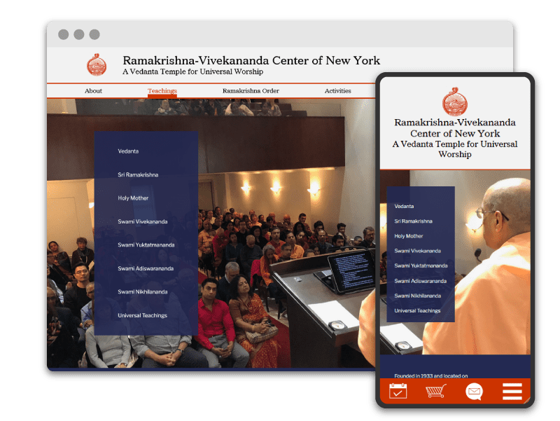
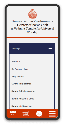
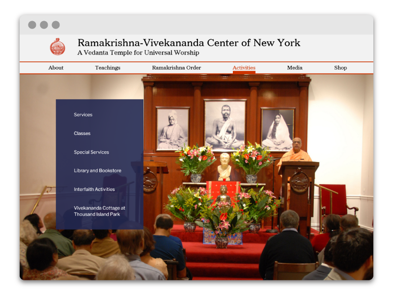
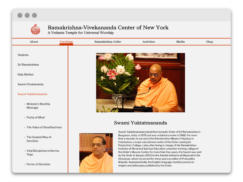
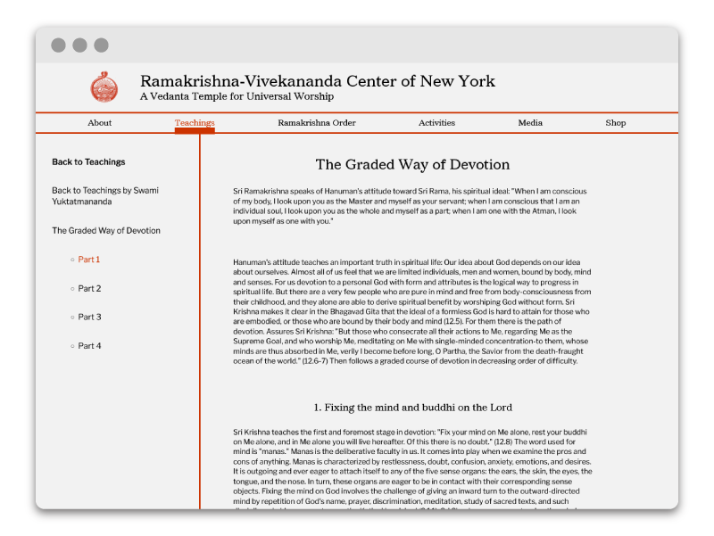
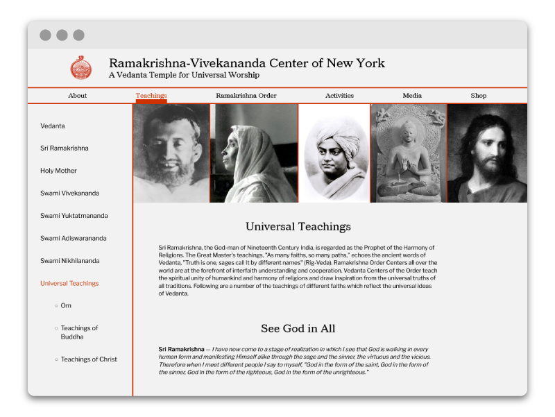
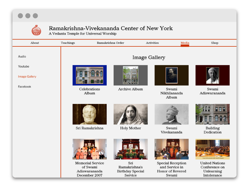
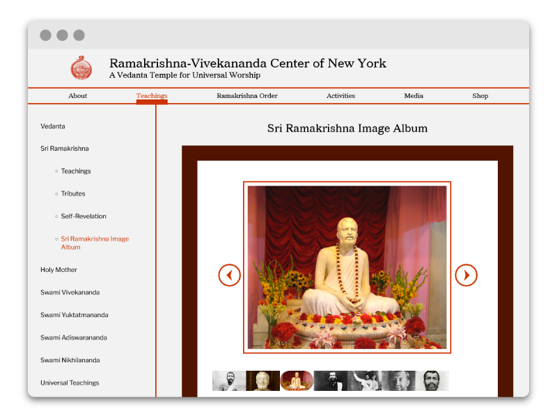
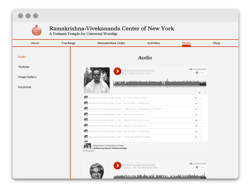
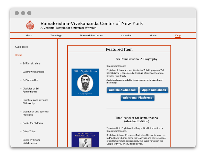
    The original website was riddled with hidden links and confusing interfaces. The new structure takes a two-pronged navigation approach, with a dominant navigation for top hierarchy links, and a secondary navigation so users can access any page within a section. This is especially important for their vast archive of spiritual teachings. Now, users can clearly navigate through a series of teachings and know exactly where they are on the site. Additionally, the mobile site features an intuitive collapsing navigation so users can minimize scroll fatigue.

    website redesign mobile display
    website redesign mobile display

    Keith Martinez

    Member of Ramakrishna-Vivekananda Center of NY

    I enlisted Sel’s help because our website was out of date and needed a total overhaul. Sel worked to understand our goals and very quickly produced diagrams so we could agree on a vision for the update. They were friendly, timely, attentive, and unafraid to learn about our full suite of functions and services. Not only did they produce a more modern, user-friendly site, Sel also showed me how to use Google Analytics so I could better understand my users. In short, Sel was a pleasure to work with and did a fantastic job. I highly recommend them.

    3. SEO & Accessibility Improvements

    As a passionate advocate of accessible design, I know that following best practices improves not only the website experience for abled and disabled users alike, but tangibly improves search rank. I took a focused pass through the website ensuring readable text, clearly identified links and buttons, and image alt texts.

  • Boston University 2018 Thesis Show Branding

    Boston University 2018 Thesis Show Branding

    1. Continuum: Designing for the Boston University School of Visual Arts Thesis Show

    Continuum is the 2018 BFA Thesis Show of Boston University School of Visual Arts. I worked with Olivia Gelard to generate the full brand identity and ad campaign for the show. We wanted to, first and foremost, represent the unity between the graphic design, painting, sculpture, and printmaking majors. Secondly, we wanted to pay homage to the 808 Gallery where the show was being hosted, since it would be undergoing major construction after our graduation. We managed the project from concept to execution, including budget management and coordinating with print studios to create physical collateral. Additionally, we curated the gallery layout, allocating spaces for each student’s work.

    continuum brand logo
    student walking into gallery with banners on either side thesis show branding
    Olivia and Sel holding the poster and sticker
    Olivia and I!

    2. Thesis Show Branding Design

    Olivia and I centered the brand concept on the unity between all visual art forms. Often different creative disciplines are put in a confining box, like the assumption that all graphic design happens on computers or that a painter couldn’t also incorporate printmaking into their work. We wanted to challenge that idea by celebrating the versatility that unites all fine artists. We chose the name Continuum because we wanted to cement our graduating class within the vast continuum of fine artists throughout time.

    multiple colored geometric sticker design
    postcard front with thesis participant list  thesis show branding
    postcard back with geometric pattern  thesis show branding

    3. Print and Digital Marketing

    Our primary visual influences were the patterns of floor tiles within the 808 gallery and möbius strips. We selected the colors and different shapes to represent each of the four visual art majors and developed patterns inspired by the gallery space to adorn the posters and event invitations. Möbius strips are the perfect visual metaphor for continuums. We used sheer acetate to create these strips and created compelling organic compositions using the sheets and their reflected shadows.

    In addition to the various pieces of print collateral created and showcased below, we also knew we needed a web presence. To meet this need, I designed a responsive web version of our poster.

    continuum poster designs thesis show branding
    Olivia holding a banner thesis show branding
    Sel holding a banner thesis show branding
  • Accessible Website Redesign and Migration for Musician-Composer

    Accessible Website Redesign and Migration for Musician-Composer

    1. Orchestrating Change: WordPress Website Redesign for Jacob Cooper Music

    Jacob Cooper, a composer and musician, came to me to redesign his website because the old one was too confusing to update. It was a cpanel hosted website using pure HTML files for each page. This meant there was no template for the pages, no global navigation, and he had to use code to update any page. He needed a new website that had a similar feel to his old one, but was way easier for him to update. You shouldn’t need to be an expert in HTML and CSS to keep a well maintained web presence.

    This website redesign began with migrating it from a cPanel hosting service to WordPress. This way, Jacob could use the WordPress dashboard to update pages, without having to battle with code. I set up a simple layout to highlight news and events, establish Jacob’s deep experience in composing and producing, and showcase his discography, including embedding streams of each album. I also updated his logo and created a playful stereo display inspired animation that plays on page load. Jacob has continually been thrilled with my service, so much so that I continue to provide web support over seven years later.

    Jacob Cooper logo, wordpress website redesign

    Jacob Cooper

    Musician

    It’s been a pleasure to work with Sel, and they vastly improved my website. I was so happy with their initial work that I’ve enlisted them for several updates since the original overhaul and they’ve always been very responsive and professional. I highly recommend hiring Sel!