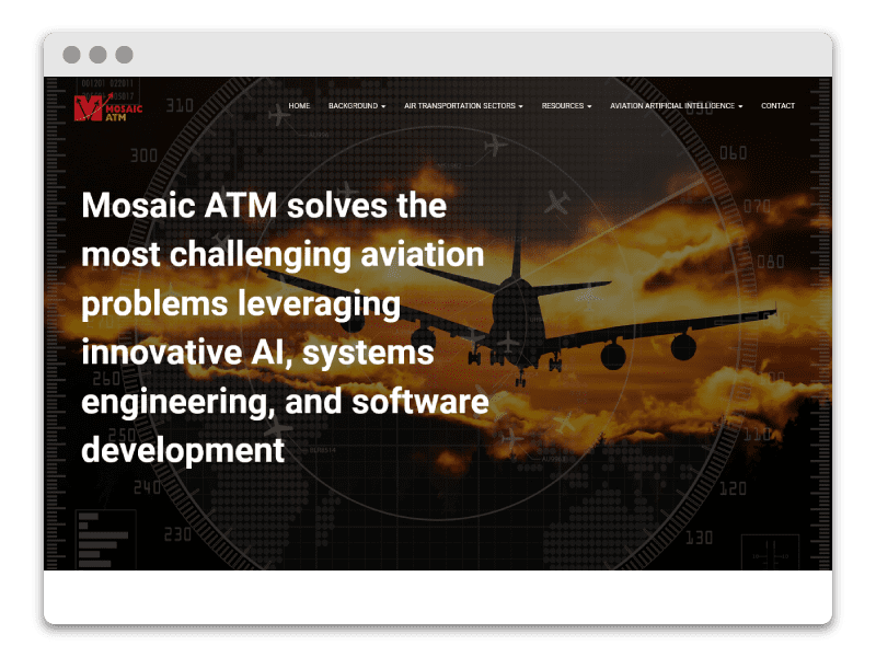
1. Mosaic ATM’s Path To Data Science Success
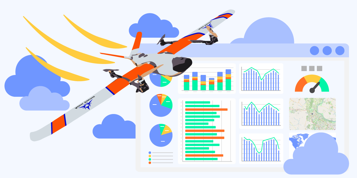
Mosaic ATM has delivered data science solutions and consulting, especially in the air traffic management sector, since 2004. Capitalizing on its success with securing federal contracts, the organization began providing data science services to the commercial sector through Mosaic Data Science (MDS) in 2009. From there, EyesOnIt launched in 2014, providing a Software as a Service (SaaS) platform centered on optimizing surveillance using cutting-edge computer vision technology. Further success saw the launch of the drone data service start-up Aerial Vantage in 2021. I joined this thriving team in 2021 as a junior web designer and rapidly rose to the role of senior digital designer. My work spanned across all of the visual components of the company, including websites, brand design, digital and print marketing, and more.
Project Type
- Website: WordPress, Wireframing, SEO, Google Suite (Analytics, Search Console, PageSpeed), Plugin Management, Marketing Software Integration (Salesforce, Pardot, Zoominfo)
- Digital Design: Digital Ads (Google Ads, LinkedIn, Meta, Clickagy, Zoominfo MarketingOs), Video Production, Social Media
- Illustration: Vector Illustration, Icons, Infographics,
- Branding: Logo, Brand Expansion
- Print Design: Solution Sheets, Case Study Templates, Mailers, Business Card, Conference Booth
- UI Design: Human Factors Consulting, Accessibility
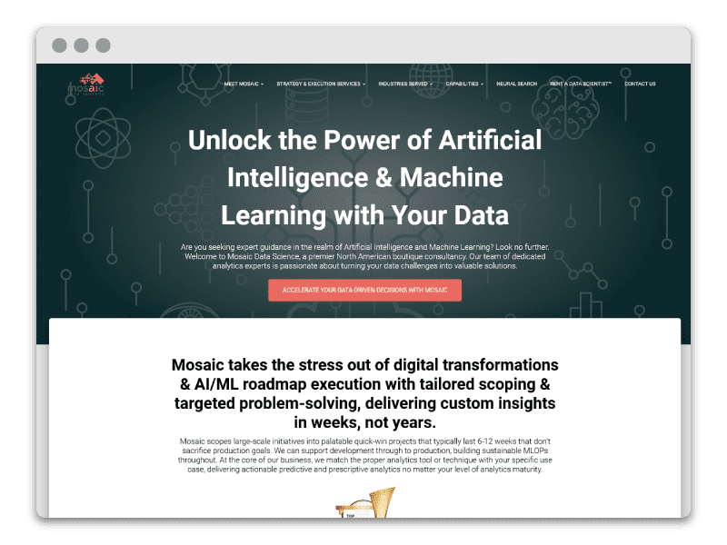
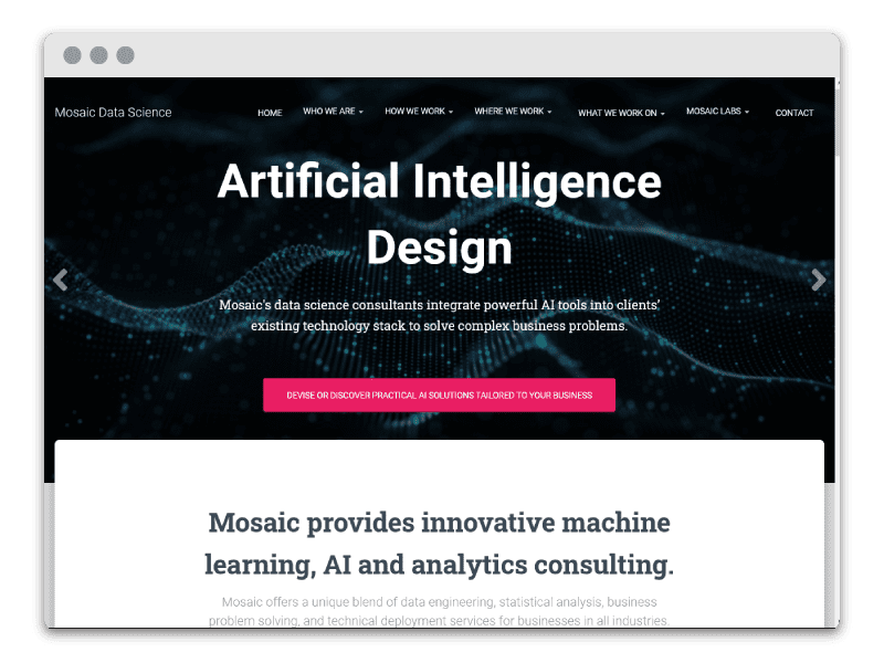
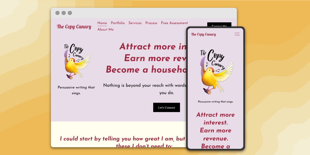
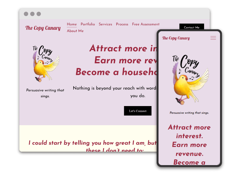
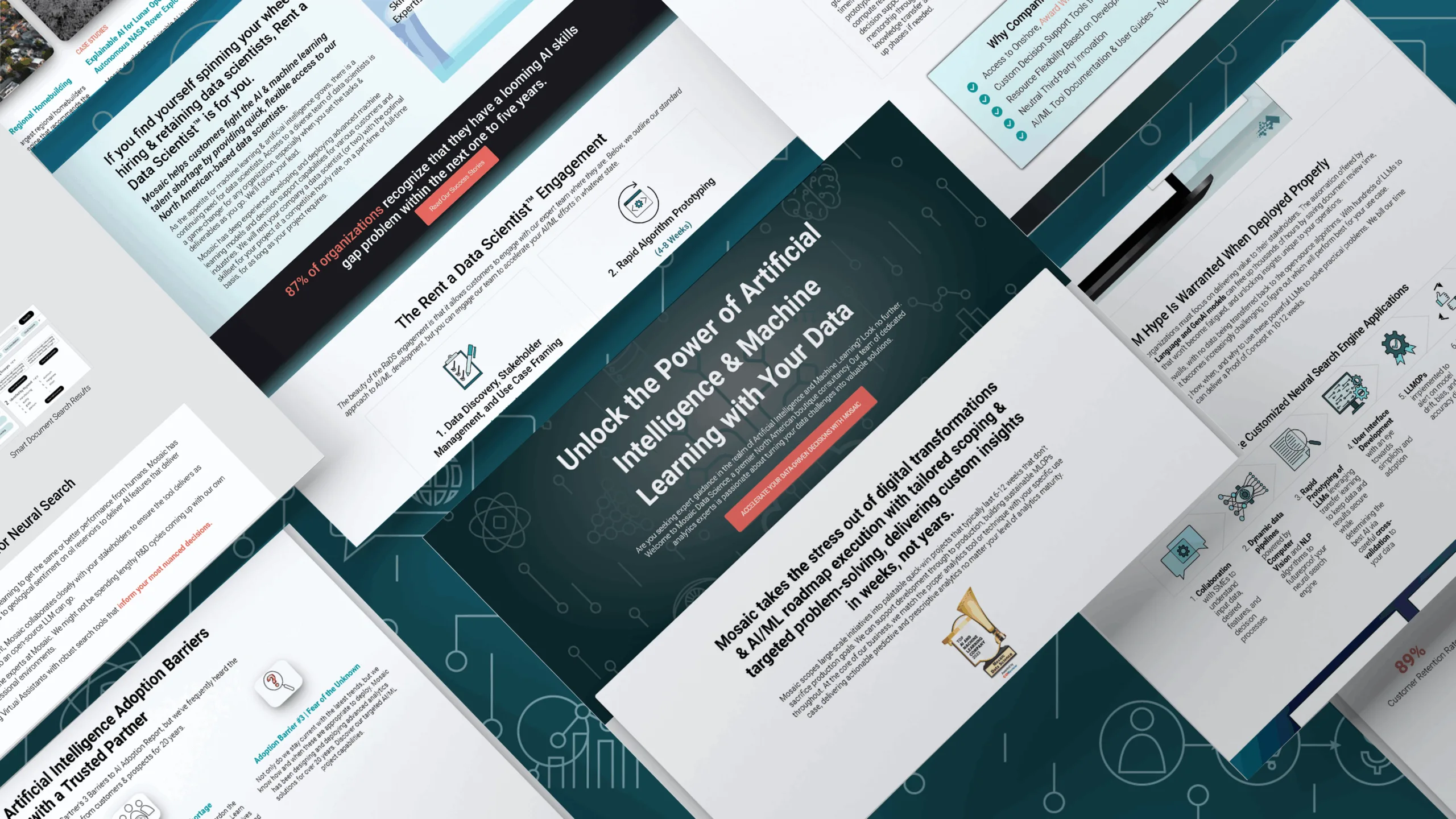
Moving away from stock imagery, Mosaic Data Science’s website gained a stronger brand identity
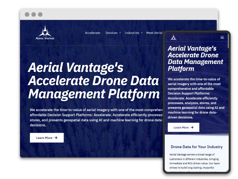
2. Website Management
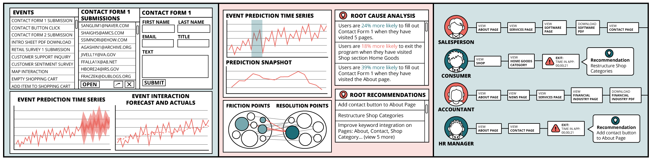
As webmaster, I managed and developed content for three unique websites. I collaborated with marketing director and marketing copywriter to generate new landing page experiences and fine tune existing pages. I developed interactive elements on the site, such as clickable infographics and embedded Tableau visualizations. In addition, I maintained site functionality by overseeing plugin and marketing software integration and integrated best practices for accessibility and search engine optimization (SEO). I also monitored site performance with tools such as Google Analytics and PageSpeed Insights.
3. Multiple Brand Expansion
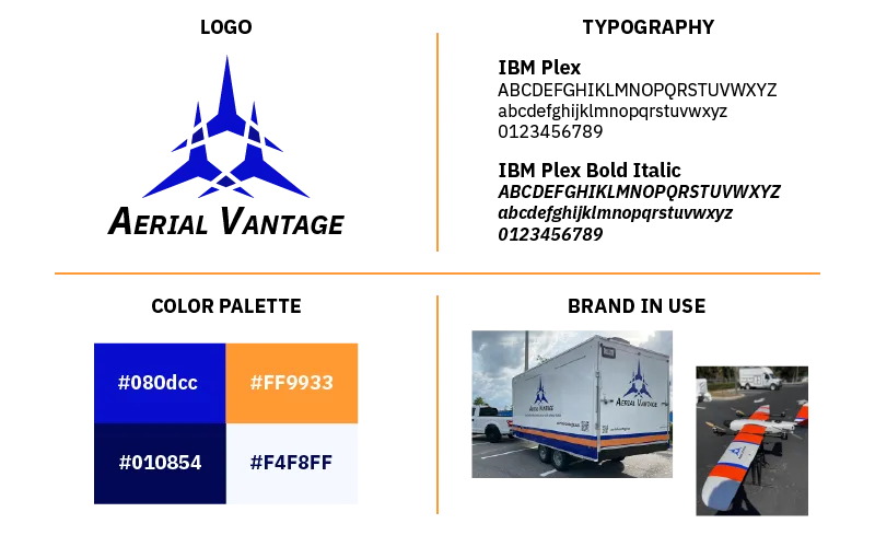
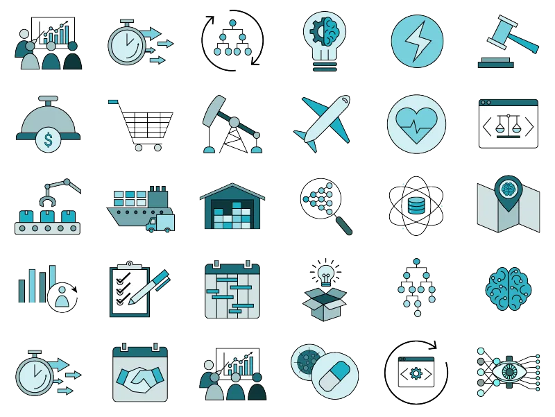
When I started working at Mosaic, the only brand component they had was the logo. I expanded each sub-brand’s identity by defining typographic hierarchies, color palettes, and visual language systems spanning all collateral from digital ads to white papers. Supporting each brand was a custom set of 200+ hand-drawn icons to differentiate their messaging from competitors. Additionally, I designed tailored logos for other brand initiatives such as the Mosaic ATM Space division and the Mosaic Data Science Canada branch and products such as Cloud FMS.
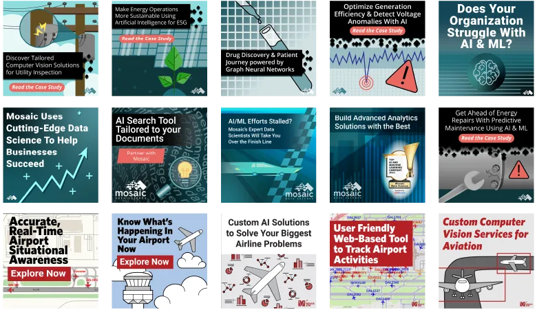
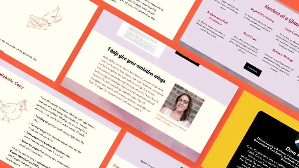
Featured Website Graphics
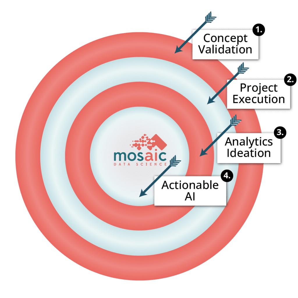
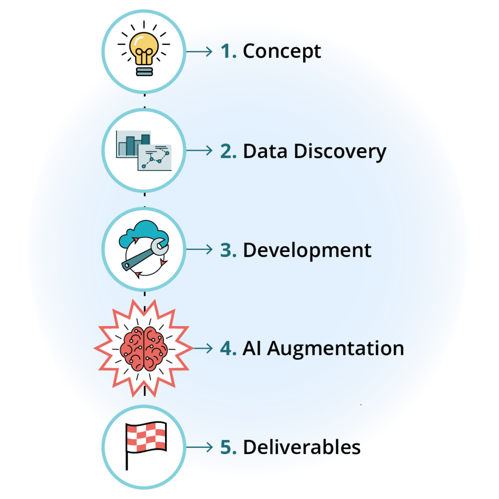

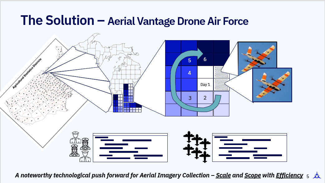
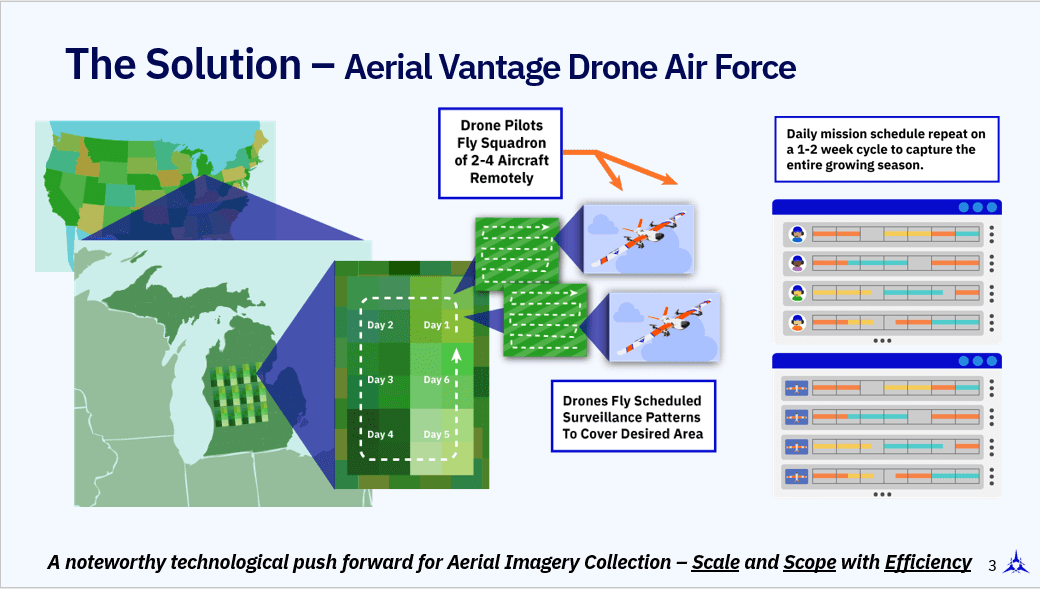
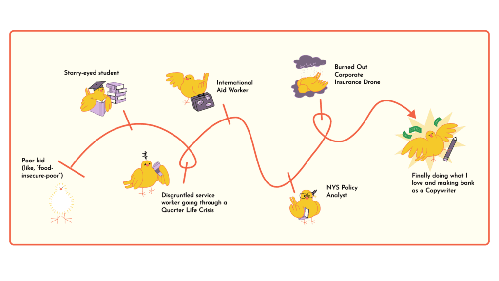
4. Executing Explainable Infographics
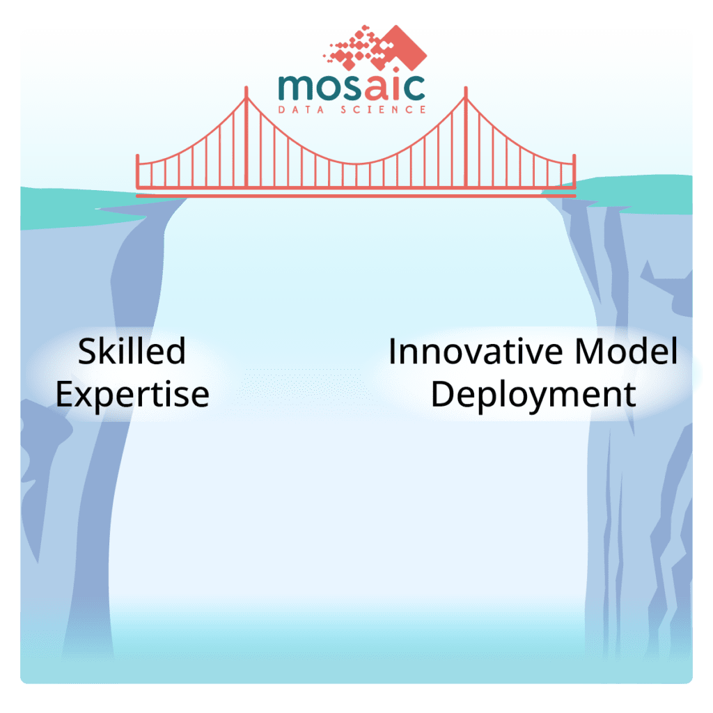
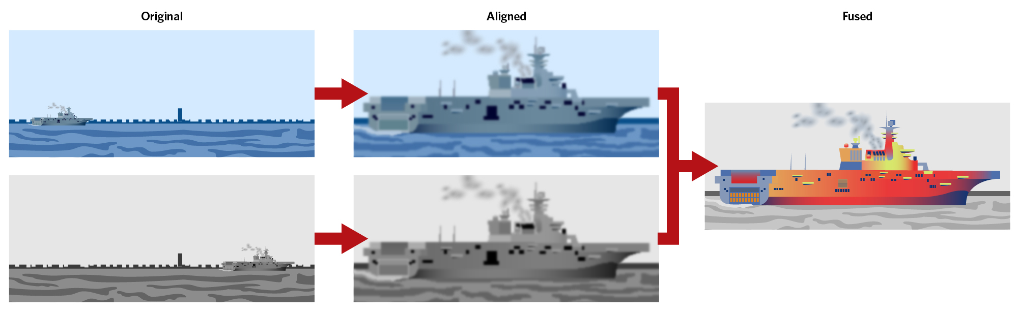
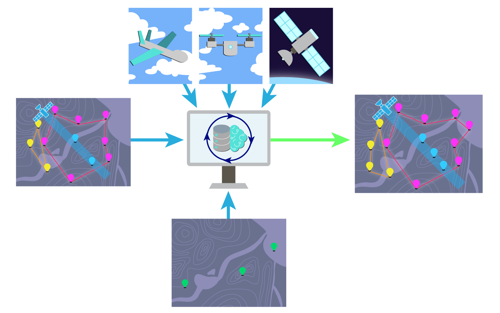
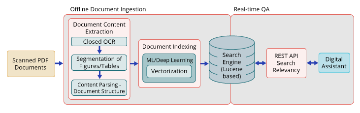
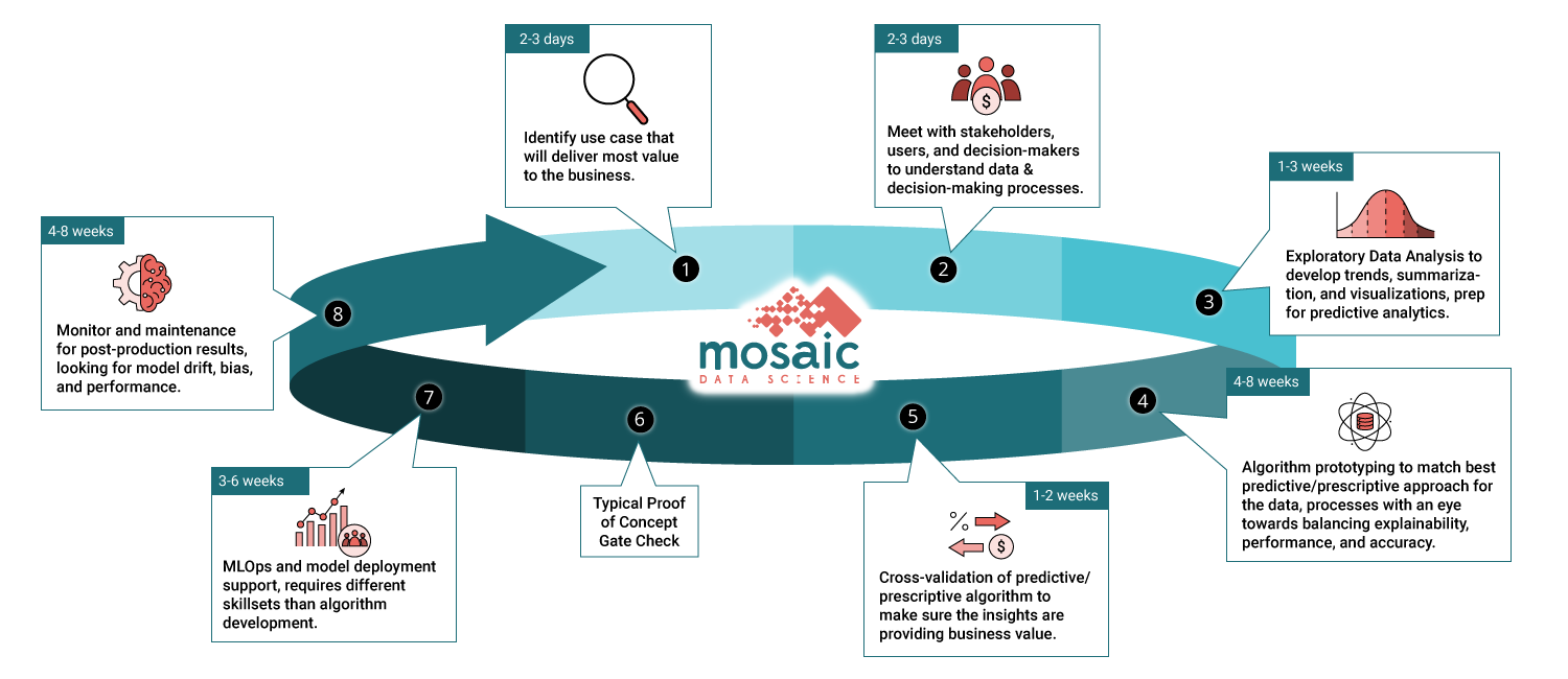
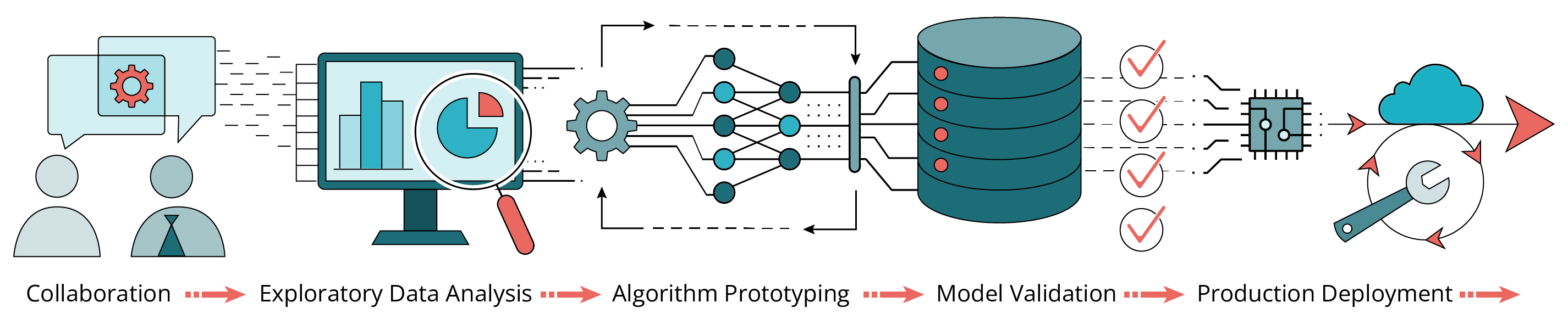
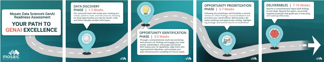
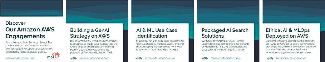
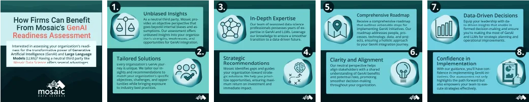
Topics like Artificial Intelligence and Machine Learning can be difficult to wrap your head around. I used my illustration skills to create unique on-brand marketing graphics and infographics that break down these complex topics to make them more understandable. I also supported contract applications with eye-catching infographics that communicates process and infrastructure flows.

Drew Clancy
VP of Marketing & Sales
I highly recommend Sel for any graphic design, digital marketing, or web development positions. Sel is a skilled and creative designer with a passion for their work. They have a deep understanding of design principles and trends, and marketing strategy, and they are able to create visually appealing and effective designs that meet the needs of clients. Sel is also an expert in web development, and they were instrumental in developing and maintaining our company websites with an eye towards innovation and growth.
In addition to their technical skills, Sel is also a team player and a quick learner. They are always willing to go the extra mile to get the job done, and they are always eager to learn new things. Sel is also a great communicator, and they are able to clearly and concisely explain their ideas to both technical and non-technical audiences.
During their time at Mosaic, Sel made significant contributions to our company’s success. Their designs helped us to increase our brand awareness and attract new customers. Sel also played a key role in developing our digital marketing campaigns, which helped us to generate new leads and increase sales. As a result of Sel’s efforts, we experienced an estimated 20% increase in revenue, a 35% increase in new customers, and a 60% increase in MQLs and SQLs.
I am confident that Sel would be an asset to any team. They are a talented and passionate designer who is always eager to learn and grow. I highly recommend Sel for any graphic design or web development position.
5. Digital Marketing Campaigns
I generated hundreds of assets for over 50 campaigns, for both paid and native advertising. We used platforms including Google Ads, LinkedIn, Meta, Clickagy, and Zoominfo display networks. I worked with the marketing director and our copywriter to fine-tune our messaging, run A/B tests, and monitor campaign performance. Additionally, I worked on branded presentation templates used for pitch decks and project summaries. Beyond static graphics, I also edited a series of short form videos and longer product demos.