Tag: Accessibility

Accessibility is the practice of ensuring a product is usable by people of all abilities, centering on those with vision, hearing, or mobility impairments.

  • Squarespace Website for Musician

    Squarespace Website for Musician

    1. A Website with Dramatic Flair

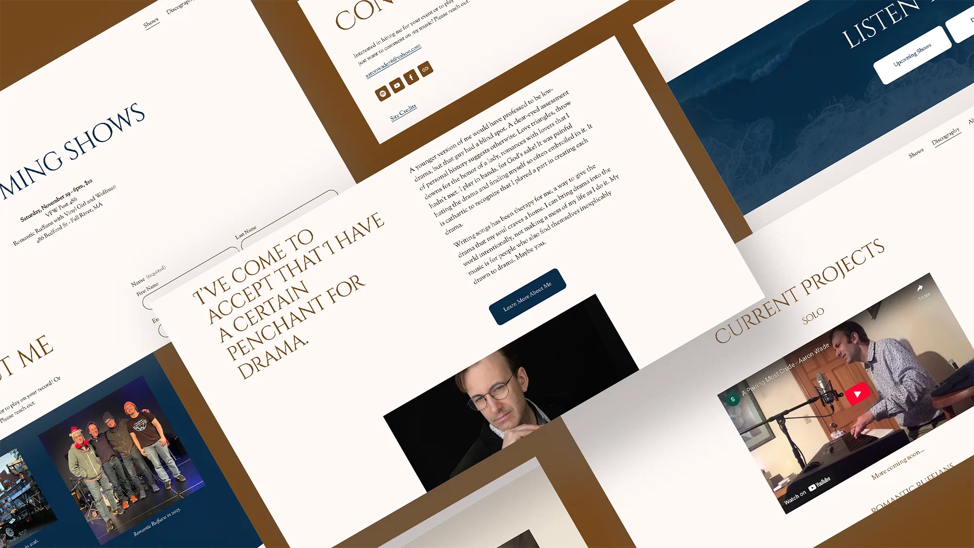
    Aaron Wade is a musician with a flair for the dramatic. He was looking for a web hub to host his discography of music, both solo and in bands. He had been struggling to build a site for months, but couldn’t find the time and bandwidth to finish it. He came to me to help him cross the finish line.

    mobile and desktop display for squarespace musician website

    2. Squarespace Website for Musician

    After discussing with Aaron, we determined the priorities for this project:

    1. Define the visual system: Aaron had already set up a good baseline for the site, but it was missing the personal touch that would take it from anyone’s website to his website. I needed to establish a typographic and color system that would fit his subdued, yet dramatic nature and musical style. I ultimately chose a warm, earthy color palette, with some navy accents and a semi-formal serif pairing with some dramatic flourishes in the headings.
    2. Create an easy to use system: Even though Squarespace is easier to use than some other CMS’s, it’s still not completely intuitive for the average person. I set up the visual system and templated blocks so that future updates will be easy for Aaron to complete himself. Post launch, I support my clients with a couple of weeks of on-demand support and design tweaks.

    As with any of my website projects, I went through all of the page designs with a fine tooth comb, ensuring pixel-perfect responsive templates that look great on desktop or mobile. I also tuned the SEO of each page, adding tailored titles/descriptions, keywords, and alt texts.

    branding for musician website

    Aaron Wade

    Musician

    Sel was instrumental in helping me finish my project. I’d been struggling to build an artist website for months but with a busy work schedule and free time better spent on my music, I couldn’t get the job done. Sel helped me get organized with a clear blueprint, unified the site thematically, and provided the knowledge and skills to finish. I now have a website that I’m proud to share.

  • Website Refresh for Galoop Classes

    Website Refresh for Galoop Classes

    1. From Tadpoles to Scholars at Galoop Classes

    Galoop is a warm, welcoming space where growth, play, and learning happen together. They host classes for children ages 6 months-4 years with their caregivers. Their unique program offers flexible schedules, diverse education and enrichment activities, bilingual story-times, and childhood development expert-backed care. Galoop’s founder, Cecilia, came to me because their website experience did not truly reflect their values and how much fun they are!

    galoop logo
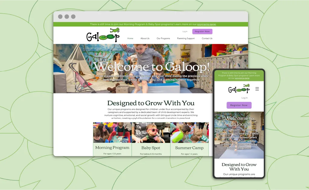
    Galoop homepage and mobile display designed with Wix
    Left ImageRight Image

    2. Wix Website Design for Early Education

    After discussing with their founder, Cecilia Matson, we identified a few focus targets for the refresh:

    1. Make the website more fun– Their old website was very minimal. On first glance, you might think they were a B2B company, not a children’s space. We needed to create a more fun and lively experience. I updated their typography, created colorful page layouts, and added some playful touches like section dividers and custom background patterns.
    2. Streamline the user experience– The main users for the Galoop website is busy parents booking on their phone. But the signup process was not intuitive. I made registration easier with improved forms and clearer language. I also tuned the page layouts to improve readability and ensure the site was fully accessible.
    3. Improve their page rank– While they knew some SEO basics, they needed some help tuning their pages. I added analytics tools and implemented better SEO practices.

    3. Icon Set + Social Graphics

    This website refresh needed a fun visual touch to pull everything together. Pulling inspiration from their cute jumping frog logo, I illustrated 40+ custom icons that appear across the website. This library of icons can be used for social media and marketing. To complete their launch, I created a bunch of easy-to-use Canva templates. Now, they have the tools for future program announcements, activity spotlights, and testimonials.

    three frog illustrations
    jungle animal illustrations, toucan, sloth, monkey, koala
    children themed icons, playground, family, hugging child
    toy themed icons, building blocks, truck, books, clock

    Cecilia Matson

    Galoop Owner/Director

    Working with Sel to redesign my business website has been a truly fantastic experience. Their creativity, clear communication, openness to feedback, and responsiveness set them apart. Having worked with website designers before, my experience with Sel was the best by far! They consistently delivered ahead of deadlines and took great care to enhance our SEO and online presence. The new website is not only beautiful but also engaging and easy to navigate. The custom icon images they created are absolutely adorable and add a unique touch. Thanks to Sel, our website not only looks amazing but performs better than ever. I highly recommend their expertise!

  • Professional Website Redesign for Fine Arts Gallery

    Professional Website Redesign for Fine Arts Gallery

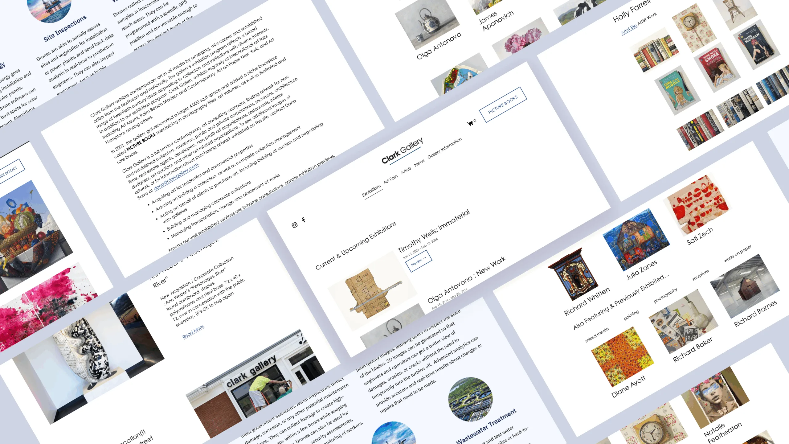
    Clark Gallery, established in 1976, is a cornerstone art gallery located in Lincoln, MA. They exhibit contemporary artists from the Northeast and nationally. After the end of Flash in 2020, websites had to make a huge shift to maintain their functionality. In this case, they couldn’t add new content to the backend and image slideshows displays, critical for an art gallery, were broken. They came to me looking for a professional website redesign that would allow them to easily update their site, add responsiveness for mobile displays, and modernize the visual style and user experience while keeping the spirit of their original brand aesthetics. Additionally, in preparation of their rare books store launch, they needed an e-commerce platform to enable online sales.

    Left ImageRight Image

    The old homepage was completely broken and didn’t showcase any of the represented artists

    2. Renovating the Website Design

    I determined that Squarespace would be the ideal content management system (CMS) for their website design needs. Not only does it have amazing frameworks for beautifully gridded designs, but it is easy to use (with a little training). I updated the layout and navigation of their website to better showcase their exhibiting artists, including a sorting functionality, a space for news posts and upcoming events, and developed their e-commerce build for their rare books store. An effective professional website redesign for small business needs to be flexible, accessible, and accommodate e-commerce.

    As a result of the relaunch, Clark Gallery has a clean and accessible web presence. They enjoy increased revenue with their new online shop. To ensure the customer’s comfort and ease in using the website, I wrote a comprehensive user guide and provided custom technical support and website training for the following year.

  • Website Design for the Vibrary

    Website Design for the Vibrary

    1. Wine & Vibes at the Vibrary

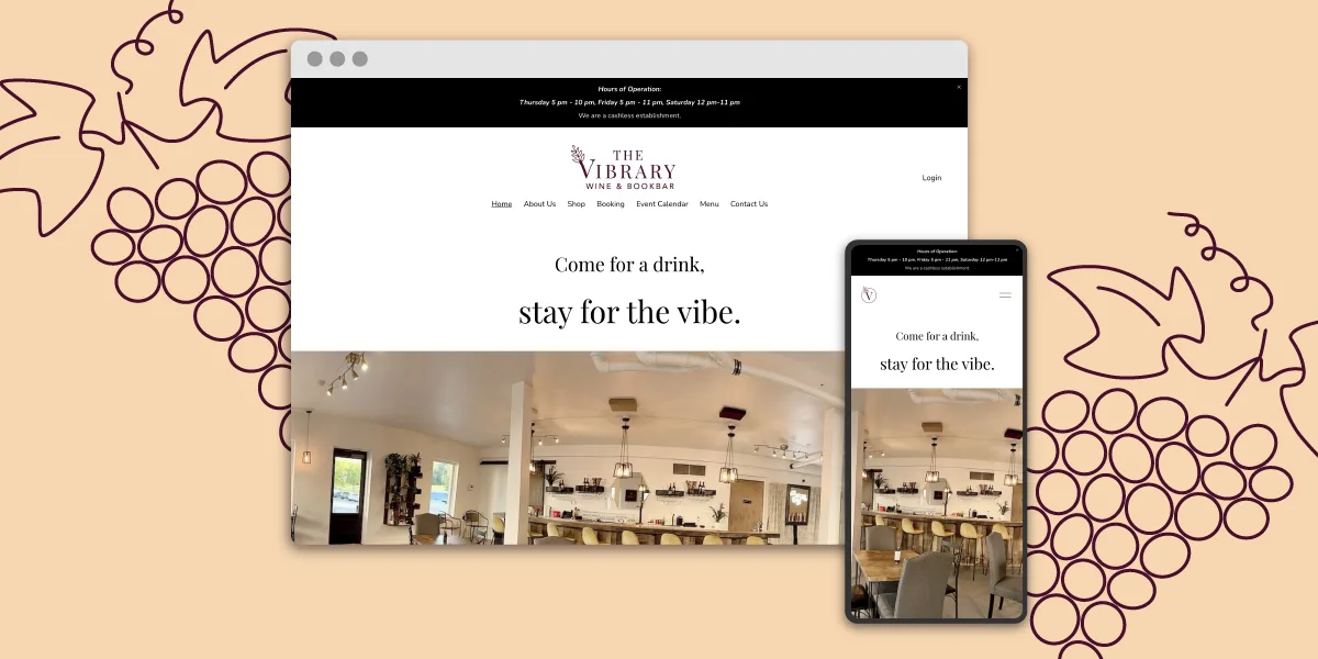
    The Vibrary is a wine and bookbar in Stone Mountain, GA that’s all about vibes. Their cozy space is ideal for meeting up with friends, trying new wines, and finding your next read. Their founder, Candace, came to me because she needed a website to round out their business launch and connect to their customers.

    vibrary home webpage, squarespace web design

    2. Squarespace Website Design for Retail

    The Vibrary needed a simple website to contextualize what their business is and what they offer, from their rotating menu to a selection of books for sale. We also added scheduling integration to make it easy for customers to check out and sign up for their frequently updated event calendar. And no website is complete without some bespoke illustrations to add color and personality to the pages.

  • Website, Branding, and Illustration for The Copy Canary

    Website, Branding, and Illustration for The Copy Canary

    1. Taking Flight Together: Original Website for Copywriter

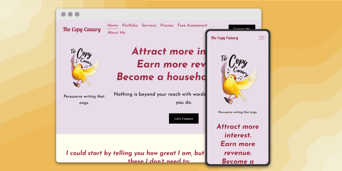
    Meet The Copy Canary, also known as Adele Sheiber, a versatile copywriting solopreneur based in Albany, New York. Adele needed a personable, engaging website to round out her business launch and attract digital clients. While she had her text perfected, she struggled to develop a cohesive visual identity for her budding business. That’s where I came in. Together, Adele and I gave wings to her brand’s visual identity, as well as its digital presence, creating a fresh and inviting space for potential clients.

    2. Website Design for Copywriter

    The root of our collaboration lies in the development of a bright and modern website that serves as The Copy Canary’s virtual home. Inspired by her dynamic logo, crafted by the talented Kristina Tran, I developed the color palette and chose a complementary type system. The site predominantly uses Josefin Sans, a round and friendly typeface, and Lobster 2, which parallels the script used in the logo. I selected the CMS Squarespace for its user-friendly interface and easy customization. This empowered Adele to take the reins of her online presence with confidence.

    3. Icon Set

    One of the standout features of this project was creating an icon set of charming canaries wearing a variety of hats. These icons not only added a playful and memorable touch to the website but also communicated the essence of The Copy Canary’s personality – approachable, professional, and delightful. Crafting these icons required both technical finesse and a keen eye for detail as I developed their clean yet organic style. They have since become a hallmark of The Copy Canary’s visual identity, enhancing user engagement and leaving a lasting impression.

    9 line drawings of canaries wearing different hats
    look at these cuties!

    Adele Sheiber

    The Copy Canary

    Sel is a genius. I really believe this. They took my half-baked ramblings, random sketches, and desperate wishes and transformed them into my dream website. I could not have launched such a polished and authentic web presence without them and I will be raving about them to literally everyone I know forever. Bonus Points: They’re super responsive and easy to work with. Stop reading and hire them already. You won’t regret it.

    4. Follow-On Work

    Our collaboration didn’t stop at the website launch. After the initial launch, I worked with Adele to create two engaging vector illustrations for The Copy Canary’s digital marketing efforts. These illustrations strengthen the brand’s identity and social media presence.

    hr manager finding a resume illustration
    career timeline with canaries
    Adele’s Career Journey
  • Accessible and Modern Redesign of a Spiritual Center’s Website

    Accessible and Modern Redesign of a Spiritual Center’s Website

    1. Elevating Spiritual Journeys: A Transformational Web Redesign

    The Ramakrishna-Vivekananda Center of New York is a branch of the Ramakrishna Order in India. Although they received consistent web traffic, their website, first launched in the early 90’s, was in dire need of a modern update. From unsupported Flash plugins to unresponsive table-formatted HTML, they needed help bringing their new vision to life. I overhauled the website and coded the redesign in pure HTML/CSS/JS. Our goals included an aesthetic refresh, a site architecture strategy, SEO improvements, and E-Commerce integration.

    Since launching, the website’s user base has increased by 60%, and page views have increased by 30%!

    Left ImageRight Image

    The Home Page Underwent a Huge Transformation

    2. Website Redesign

    The original website was right out of a Web 2.0 playbook, plastered with heavily textured backgrounds, broken plugins, and unintuitive galleries, they needed a fresh approach to invite users to discover their spiritual teachings. Taking a minimalist approach, the new website features a clean and organized structure accented with their practice’s characteristic red. It is also fully responsive, delivering mobile site visitors an accessible and readable experience.

    teachings hub page on desktop and mobile, website redesign

    3. Strategic Organization

    The original website was riddled with hidden links and confusing interfaces. The new structure takes a two-pronged navigation approach, with a dominant navigation for top hierarchy links, and a secondary navigation so users can access any page within a section. This is especially important for their vast archive of spiritual teachings. Now, users can clearly navigate through a series of teachings and know exactly where they are on the site. Additionally, the mobile site features an intuitive collapsing navigation so users can minimize scroll fatigue.

    website redesign mobile display
    website redesign mobile display

    Keith Martinez

    Member of Ramakrishna-Vivekananda Center of NY

    I enlisted Sel’s help because our website was out of date and needed a total overhaul. Sel worked to understand our goals and very quickly produced diagrams so we could agree on a vision for the update. They were friendly, timely, attentive, and unafraid to learn about our full suite of functions and services. Not only did they produce a more modern, user-friendly site, Sel also showed me how to use Google Analytics so I could better understand my users. In short, Sel was a pleasure to work with and did a fantastic job. I highly recommend them.

    3. SEO & Accessibility Improvements

    As a passionate advocate of accessible design, I know that following best practices improves not only the website experience for abled and disabled users alike, but tangibly improves search rank. I took a focused pass through the website ensuring readable text, clearly identified links and buttons, and image alt texts.

  • Accessible Website Redesign and Migration for Musician-Composer

    Accessible Website Redesign and Migration for Musician-Composer

    1. Orchestrating Change: WordPress Website Redesign for Jacob Cooper Music

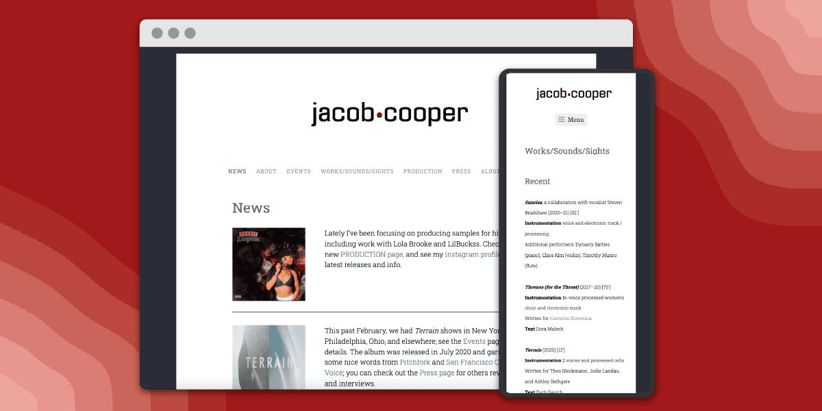
    Jacob Cooper, a composer and musician, came to me to redesign his website because the old one was too confusing to update. It was a cpanel hosted website using pure HTML files for each page. This meant there was no template for the pages, no global navigation, and he had to use code to update any page. He needed a new website that had a similar feel to his old one, but was way easier for him to update. You shouldn’t need to be an expert in HTML and CSS to keep a well maintained web presence.

    This website redesign began with migrating it from a cPanel hosting service to WordPress. This way, Jacob could use the WordPress dashboard to update pages, without having to battle with code. I set up a simple layout to highlight news and events, establish Jacob’s deep experience in composing and producing, and showcase his discography, including embedding streams of each album. I also updated his logo and created a playful stereo display inspired animation that plays on page load. Jacob has continually been thrilled with my service, so much so that I continue to provide web support over seven years later.

    Jacob Cooper logo, wordpress website redesign

    Jacob Cooper

    Musician

    It’s been a pleasure to work with Sel, and they vastly improved my website. I was so happy with their initial work that I’ve enlisted them for several updates since the original overhaul and they’ve always been very responsive and professional. I highly recommend hiring Sel!