
Brand Guide
The brand guide ties all branding components together in an easy to digest format. It covers logos, typography, color palette, brand assets, brand voice, art direction, and more.
-

Clear Horizons Astrology Logo and Brand Strategy
I crafted a custom logo and brand identity for a new astrology reading business. Plus, I helped out with business strategy and positioning.
-

Packaging Design and Graphic Production for Hasbro
I joined the Hasbro Games team working on game pitches, generating packaging layout mock-ups, and preparing files for hand-off to manufacturers.
-

Drone Data Service’s Brand Identity & Website
Discover Aerial Vantage’s drone data service visual identity including branding, website, and a comprehensive online presence.
-

Brand Identity and Website for Health Coach Service
I created a logo, brand strategy, visual system, and custom Squarespace website for Stone Lotus Health Coaching, a holistic health consultancy.
-
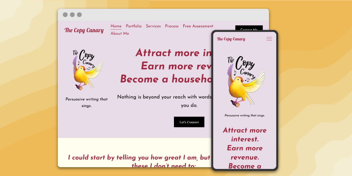
Website, Branding, and Illustration for The Copy Canary
I give wings to a website design for copywriter The Copy Canary, as well as expanding their brand and creating custom illustrations.