1. Elevating Spiritual Journeys: A Transformational Web Redesign
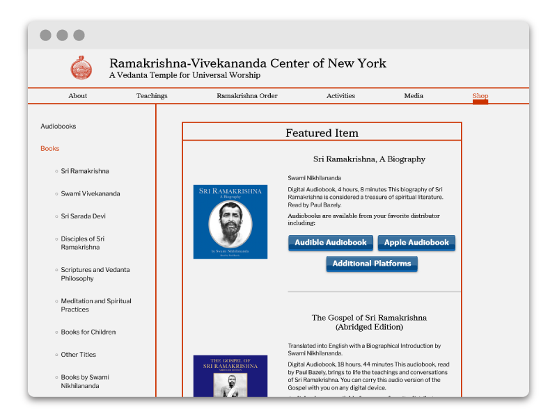
The Ramakrishna-Vivekananda Center of New York is a branch of the Ramakrishna Order in India. Although they received consistent web traffic, their website, first launched in the early 90’s, was in dire need of a modern update. From unsupported Flash plugins to unresponsive table-formatted HTML, they needed help bringing their new vision to life. I overhauled the website and coded the redesign in pure HTML/CSS/JS. Our goals included an aesthetic refresh, a site architecture strategy, SEO improvements, and E-Commerce integration.
Since launching, the website’s user base has increased by 60%, and page views have increased by 30%!

Project Type
- Website: HTML/CSS, Javascript, Wireframing, Accessibility, Search Engine Optimization, E-Commerce Integration, Google Analytics Integration
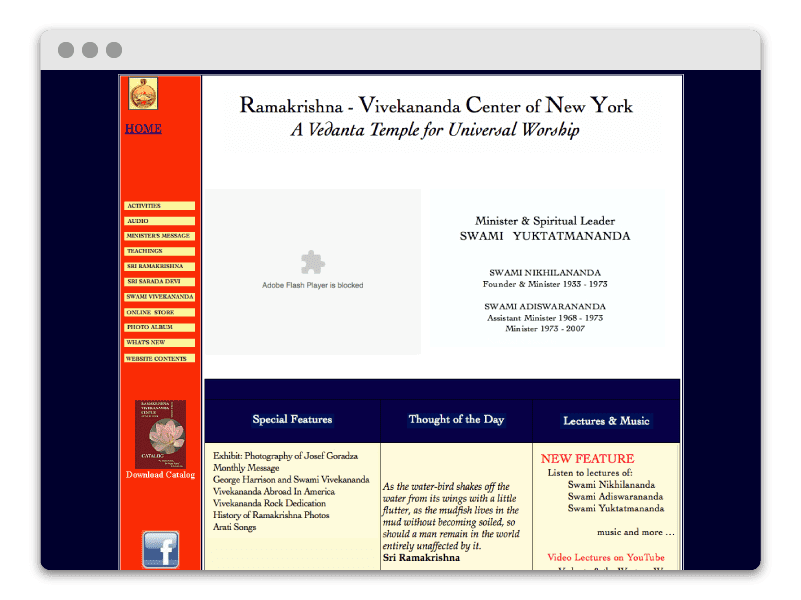
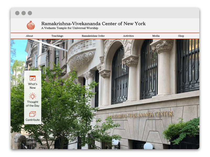
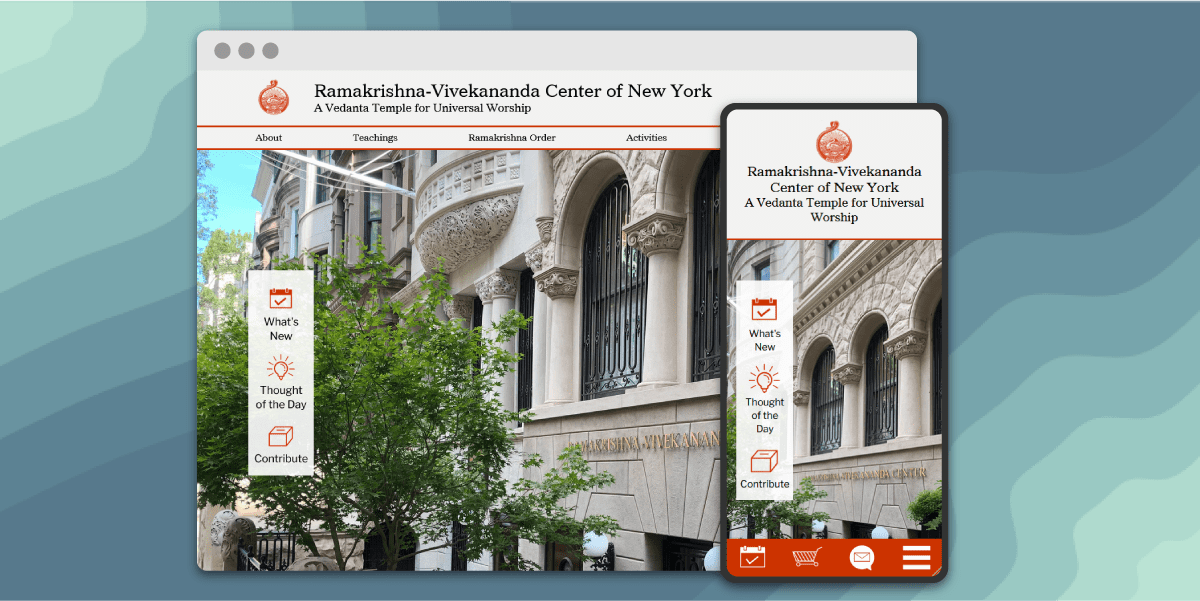
The Home Page Underwent a Huge Transformation
2. Website Redesign
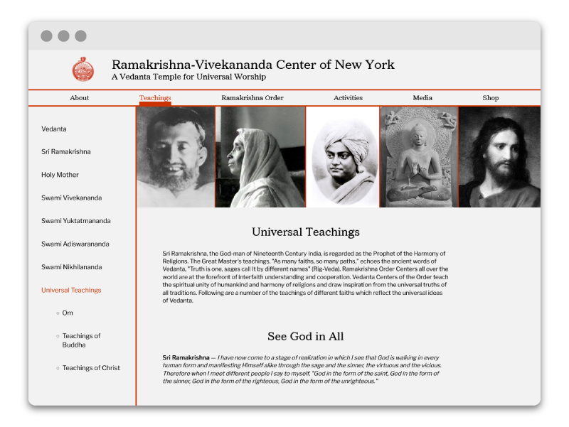
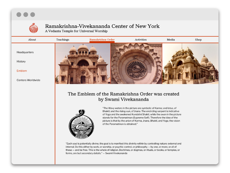
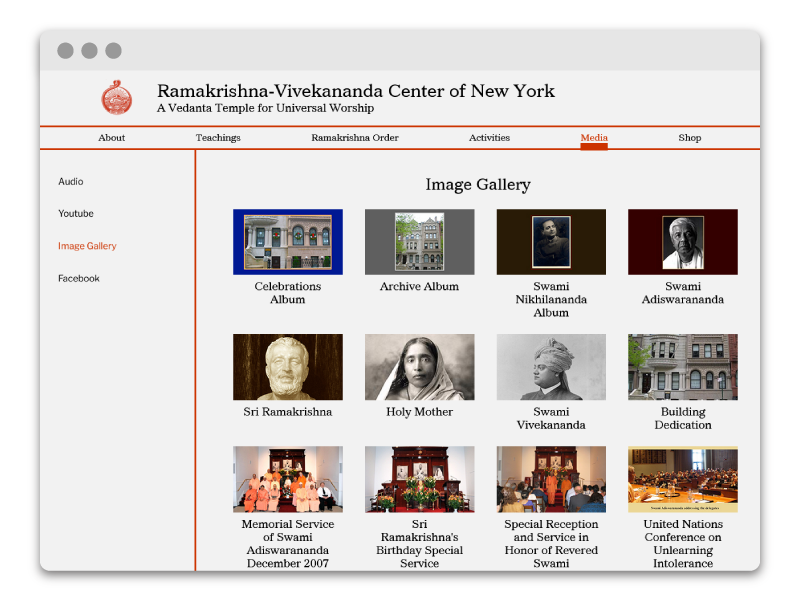
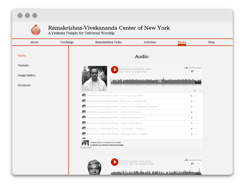
The original website was right out of a Web 2.0 playbook, plastered with heavily textured backgrounds, broken plugins, and unintuitive galleries, they needed a fresh approach to invite users to discover their spiritual teachings. Taking a minimalist approach, the new website features a clean and organized structure accented with their practice’s characteristic red. It is also fully responsive, delivering mobile site visitors an accessible and readable experience.
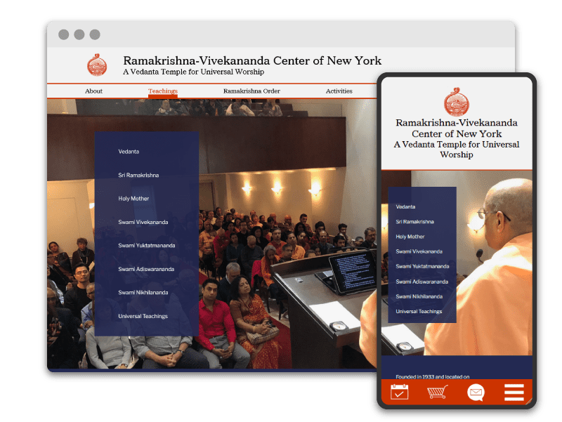
3. Strategic Organization
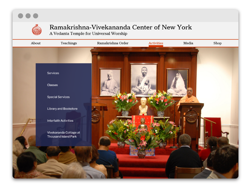
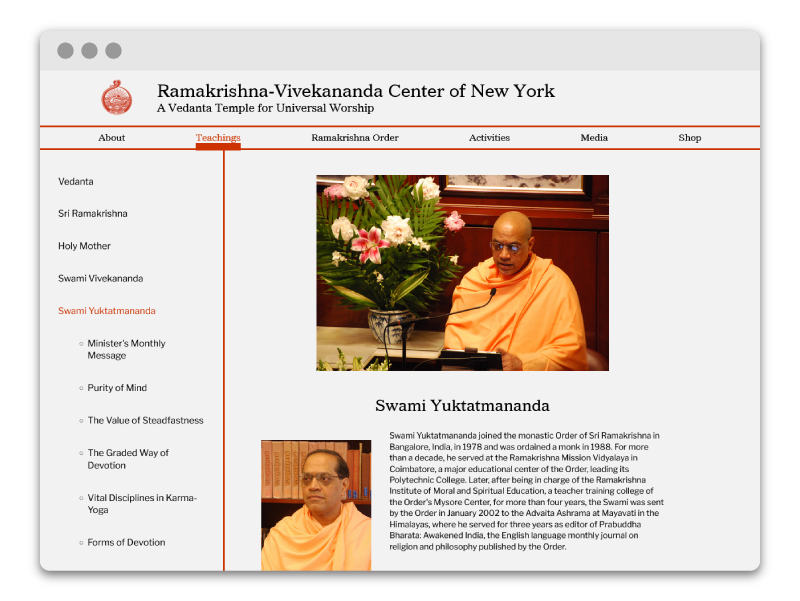
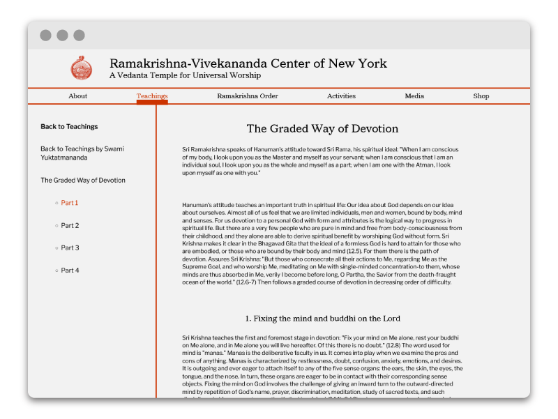
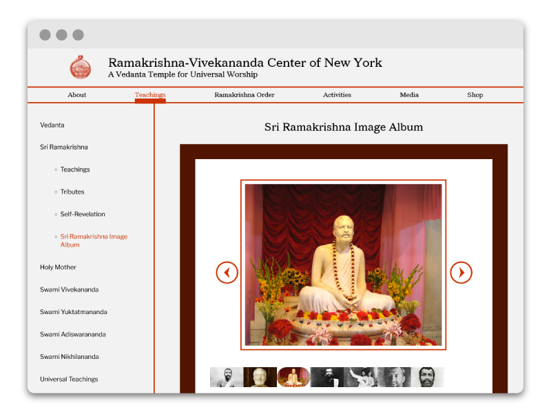
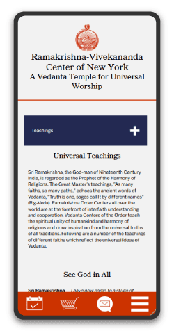
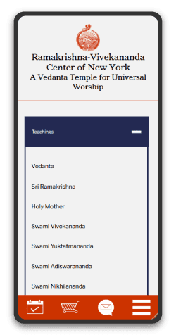
The original website was riddled with hidden links and confusing interfaces. The new structure takes a two-pronged navigation approach, with a dominant navigation for top hierarchy links, and a secondary navigation so users can access any page within a section. This is especially important for their vast archive of spiritual teachings. Now, users can clearly navigate through a series of teachings and know exactly where they are on the site. Additionally, the mobile site features an intuitive collapsing navigation so users can minimize scroll fatigue.
Keith Martinez
Member of Ramakrishna-Vivekananda Center of NY
I enlisted Sel’s help because our website was out of date and needed a total overhaul. Sel worked to understand our goals and very quickly produced diagrams so we could agree on a vision for the update. They were friendly, timely, attentive, and unafraid to learn about our full suite of functions and services. Not only did they produce a more modern, user-friendly site, Sel also showed me how to use Google Analytics so I could better understand my users. In short, Sel was a pleasure to work with and did a fantastic job. I highly recommend them.
3. SEO & Accessibility Improvements
As a passionate advocate of accessible design, I know that following best practices improves not only the website experience for abled and disabled users alike, but tangibly improves search rank. I took a focused pass through the website ensuring readable text, clearly identified links and buttons, and image alt texts.

