1. Taking Flight Together: Original Website for Copywriter
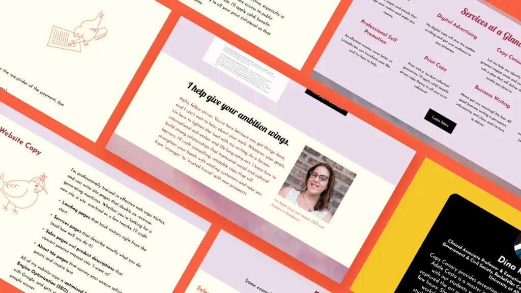
Meet The Copy Canary, also known as Adele Sheiber, a versatile copywriting solopreneur based in Albany, New York. Adele needed a personable, engaging website to round out her business launch and attract digital clients. While she had her text perfected, she struggled to develop a cohesive visual identity for her budding business. That’s where I came in. Together, Adele and I gave wings to her brand’s visual identity, as well as its digital presence, creating a fresh and inviting space for potential clients.
Project Type
- Website: Squarespace, Wireframing, Accessibility
- Branding: Strategy, Typography Hierarchy, Color Palette, Brand Guide
- Illustration: Icons, Marketing Illustration, Vector Graphics
2. Website Design for Copywriter
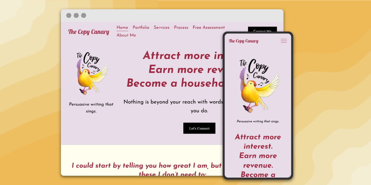
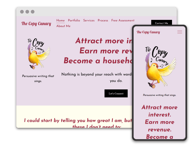
The root of our collaboration lies in the development of a bright and modern website that serves as The Copy Canary’s virtual home. Inspired by her dynamic logo, crafted by the talented Kristina Tran, I developed the color palette and chose a complementary type system. The site predominantly uses Josefin Sans, a round and friendly typeface, and Lobster 2, which parallels the script used in the logo. I selected the CMS Squarespace for its user-friendly interface and easy customization. This empowered Adele to take the reins of her online presence with confidence.
3. Icon Set
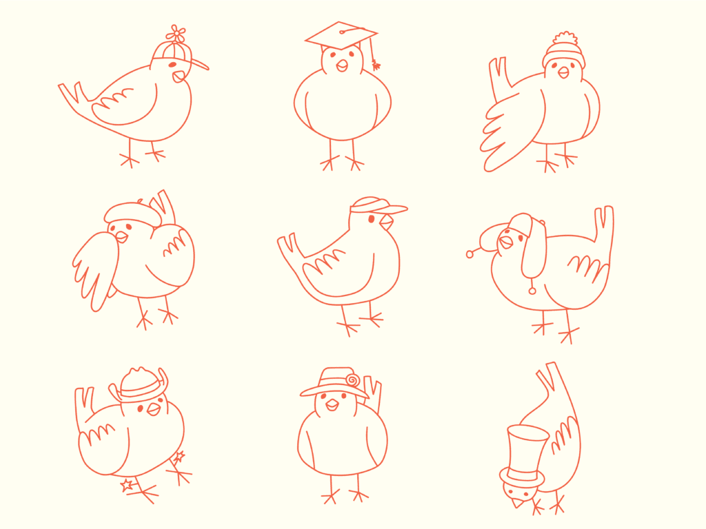
One of the standout features of this project was creating an icon set of charming canaries wearing a variety of hats. These icons not only added a playful and memorable touch to the website but also communicated the essence of The Copy Canary’s personality – approachable, professional, and delightful. Crafting these icons required both technical finesse and a keen eye for detail as I developed their clean yet organic style. They have since become a hallmark of The Copy Canary’s visual identity, enhancing user engagement and leaving a lasting impression.
Adele Sheiber
The Copy Canary
Sel is a genius. I really believe this. They took my half-baked ramblings, random sketches, and desperate wishes and transformed them into my dream website. I could not have launched such a polished and authentic web presence without them and I will be raving about them to literally everyone I know forever. Bonus Points: They’re super responsive and easy to work with. Stop reading and hire them already. You won’t regret it.
4. Follow-On Work
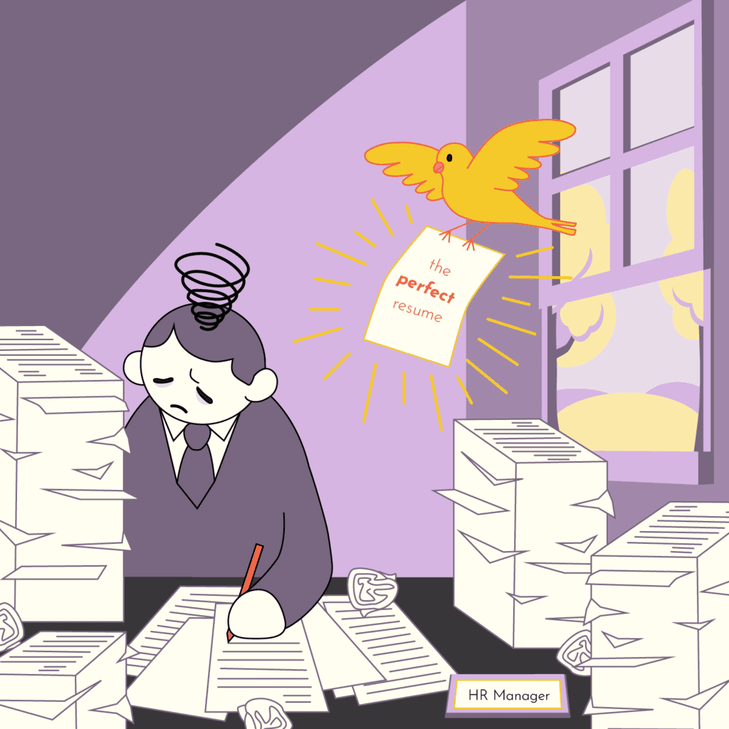
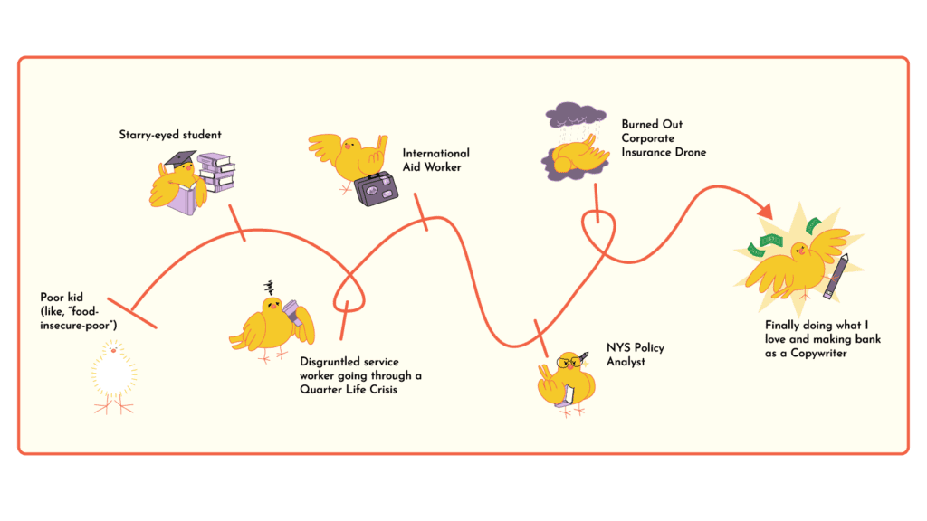
Our collaboration didn’t stop at the website launch. After the initial launch, I worked with Adele to create two engaging vector illustrations for The Copy Canary’s digital marketing efforts. These illustrations strengthen the brand’s identity and social media presence.
